Lackneets Chang
aka Dr. Xiao-Yao
I work across frontend, backend, and design — the whole stack, with years of hands-on product development experience.
PlurkCustoms
PlurkCustoms started from a very personal need and eventually grew into one of my most representative community products. It began as a way to overcome the limits and friction of Plurk custom emoticons, then gradually evolved into a more complete toolset with emoticon management, faster input, backup support, and a much smoother workflow.
This project matters to me because it was the first time I deeply felt that a seemingly tiny user pain point — if identified precisely and solved cleanly — can grow into something people rely on for years. It became an everyday extension for many Plurk users, and it pushed me to think more seriously about product evolution, usability, and maintenance cost.
PlurkCustoms | Source: GitHub/PlurkCustoms
KarmaPolice
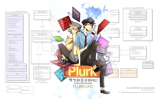
KarmaPolice is one of the most representative personal projects from my early years. It started as a bot I built for my own online work and server operations, then gradually evolved into a public-facing character that interacted with large groups of users and even developed a distinct personality and community culture.
In its time, it was not merely a reply bot. It was a system with Chinese conversational logic, multi-turn interaction, and a very deliberate sense of character. Watching it grow from a private utility into something people remembered, built on together, and even remixed left a deep impression on me. I see it less as a technical demo and more as a digital character that genuinely lived inside a community.
What makes KarmaPolice important is not only that it was early, or technically ambitious, but that it brought together utility, interaction, and character. If there is any project that best represents my early imagination around interactive products, community participation, and digital character design, this is definitely one of them.
Locate
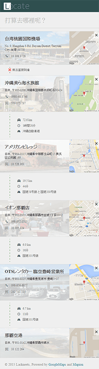
Denso Mapcode is widely used in Japanese car navigation, but travelers often only have a place name or address, which makes the lookup flow awkward.
Locate compresses that messy process into a single input. You type a destination name, and it gives you both the address and the Mapcode without forcing you to jump between multiple sources. The app was built with ReactJS, with careful attention to caching and API efficiency so the whole experience stays fast and lightweight.
To me, Locate is a good example of how I like to build utility products: start with a concrete real-world use case, then reduce the information, workflow, and interface into something direct and genuinely useful.
Visit Locate
Sheepy Web Cloner
Sheepy is a personal project I have always loved. It was never meant to be just another “save webpage” tool. Its goal was to preserve the actual state a user was looking at, so that dynamic pages, logged-in views, and even parts of web apps could be carried around and reproduced later.
The project began with a question about the limits of browser-side persistence. If conventional saving cannot truly preserve interactive state, could there be an approach closer to “visual snapshot + packaged state”? Sheepy was born from that idea. It is especially useful for things like booking and ticketing result pages: when you want to preserve the full result faithfully, but PDF tends to break layouts and screenshots cannot capture the whole page cleanly.
It is very much my style: start from a technical problem people rarely address directly, find a method that actually works, then package it into something ordinary users can understand and use. To me, this is not just a browser extension — it is a concrete experiment in web portability. Source: GitHub/chrome-sheepy
Eatgo Booking System
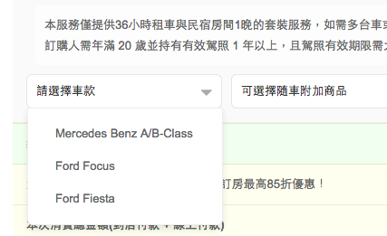
During my time at Eatgo, I worked on the customer-facing booking system and kept expanding it as the business grew. What started as a basic reservation flow for a small number of listings gradually evolved into a system that could handle multiple room types, add-on services, different property rules, and synchronized booking across several rooms.
The challenge was not simply to build a booking flow, but to keep the system usable, adaptable, and extensible while business rules changed constantly. Beyond the customer-facing experience, I also worked on management-side improvements such as room operations, batch actions, and calendar synchronization, making daily workflows smoother for both operators and customer service.
It is not a flashy demo project, but it represents well how I handle real business requirements: taking a product surrounded by constraints, exceptions, and operational pressure, then steadily shaping it into a more reliable system.
Book multiple rooms in one order
Add-on services (car rental)
Admin dashboard
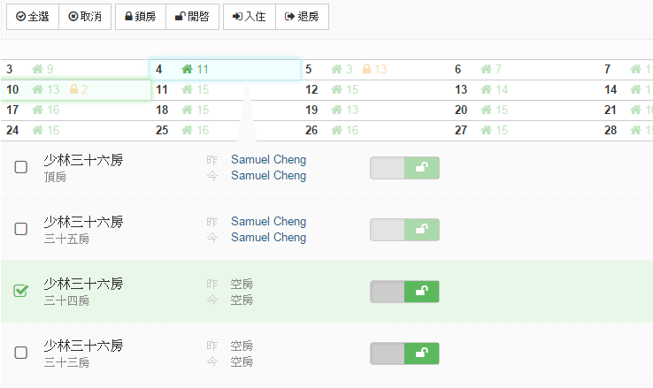
Room operations (support & hosts)
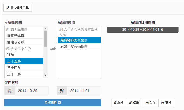
Batch room management
Eatgo Cafe

Eatgo Cafe is a mobile-oriented cafe discovery site that organizes partner coffee shops and lets people filter them by MRT line, shop features, and other practical criteria. The desktop version offers fuller browsing and sharing, while the mobile version is intentionally simplified to focus on nearby shops and quick navigation.
What I like about this project is that it was not about stuffing in more information, but about making the right trade-offs for the usage context. When people are outside looking for a cafe, they want speed, clarity, and fewer taps, so I kept the interface light and focused.
The content pipeline was also designed to be easy to maintain through Google Spreadsheet, which kept operational cost low. It is a small product, but it reflects how I usually work: think about the data source, the real usage scenario, and the interface rhythm together before deciding what the product should become.
Firefly Map
Firefly Map is an interactive campaign page built around a seasonal event. It combines map interaction, regional navigation, and curated destination information so people can explore firefly viewing spots and nearby accommodation more intuitively.
The core idea was not just to place information on a website, but to turn browsing into a more natural discovery flow: start from a region, then move into points of interest and lodging content. That made the guide feel less like a static list and more like how people actually think while planning a trip.
Although it was not a huge project, it represents my way of building content-driven pages: compressing information architecture, interaction design, and visual presentation into something useful and memorable within a tight schedule and a clear commercial goal.
View page
| jVectorMap Taiwan
Yahoo Shopping Campaigns
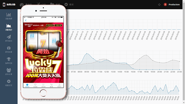
Projects like Yahoo Shopping campaigns feel to me like training in commercial execution rhythm. They do not carry the same long technical narrative as personal products, but they are excellent tests of how quickly you can digest requirements and land the page accurately within a fixed platform, schedule, and campaign objective.
These projects usually require planning translation, visual integration, frontend implementation, and campaign-detail handling in a short time. The goal is not to build a huge system, but to turn business messaging, user actions, and page pacing into something clear and effective.
It may not be the most personal work in this portfolio, but it shows another side of me in commercial projects: delivering solid work consistently in an environment with clear constraints and fast tempo.
g0v Political Contribution Database
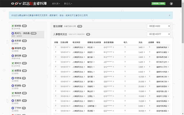
The g0v Political Contribution Database is one of my representative civic-tech collaborations. The heart of the project was turning political contribution records that originally existed on paper into searchable, analyzable digital data through image slicing, crowdsourced recognition, and structured data cleanup.
This project was meaningful to me because it was not just website development. It sat at the intersection of information structuring, collaborative workflow, and public issues. It made me understand more concretely that technology is not only for products — it can also make data more transparent and public discussion more grounded.
Source: GitHub/campaign-finance
Cloud Bookmark
Cloud Bookmark is a small tool that came directly from a real usage need. Its goal was simple: provide a lightweight landing page where users could organize and manage frequently used links instead of leaving bookmarks scattered inside the browser.
What made this project interesting was that it naturally extended into website metadata fetching and text-encoding detection. At the time I had to handle pages that were not in Unicode, so I explored more engineering-heavy approaches to infer likely language and encoding types. It was not a big product, but it reflects how I build tools: break the problem down first, then fill in the technical details required to make the tool actually useful.
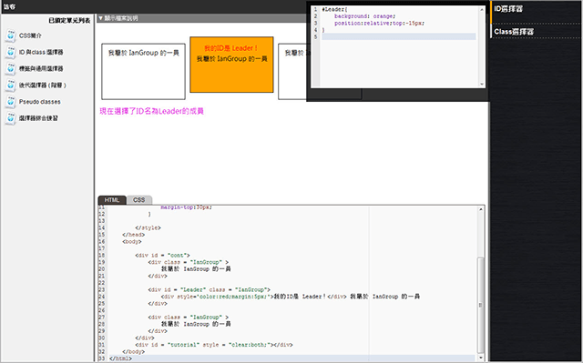
Online Mosaic Design
Discover Emoticons
Discover Emoticons was an experimental project extended from a data-mining course, using the Apriori method to explore relationships between Plurk emoticons. It was more of a learning-oriented proof of concept, but it also reflected my interest at the time in data analysis and user behavior patterns.
Taipei Day Trip Planner
Taipei Day Trip Planner was an experimental tool I conceived while working at Eatgo, inspired by real travel-planning needs. Its purpose was to automatically compose a one-day itinerary and estimate travel time under a set of constraints, turning a mostly manual planning process into a prototype that could be tested quickly.
The value was not in being a complete product, but in connecting algorithms, place data, and real travel scenarios into a tool that could genuinely support planning decisions.
EmotionViz
This was a team graduation project completed during my time at design school. Unlike mainstream social media, EmotionViz imagined a community built around voice, with color used as a way to record and express emotional change.
When we decided to build it, I did not expect audio recording to become the hardest part. The answer ended up being the then-new Flash 10.1 beta and its Alchemy technology, which let us use a C-based LAME encoder.
CodeShare
CodeShare was one of my student graduation projects, created as a learning platform for practicing and testing web development online. It combined instructional design, immediate feedback, and a simple sandbox execution concept. It still clearly looks like a prototype today, but you can already see my long-term interest in how tools can support learning.
Jigsaw
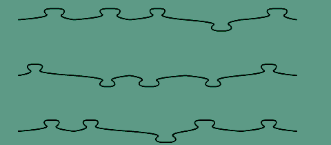
This project had only two real challenges: cutting and assembling. The puzzle pieces were generated by drawing dynamic Bézier curves, then filling them with bitmap textures. To get the snapping effect I wanted, the built-in hitTest was not enough, so I had to implement my own piece management using absolute coordinates. I still remember lying in bed for three nights in a row thinking through the approach before sleep.
Smart Dots
This is a simple implementation of the classic pencil-and-paper game Dots and Boxes. The fun of the AI lay in turning human decision patterns into program logic — with the difference that the computer can evaluate every possibility in a fraction of a second. And of course, beyond brute evaluation, there is always the more interesting layer: strategy.
Other Works
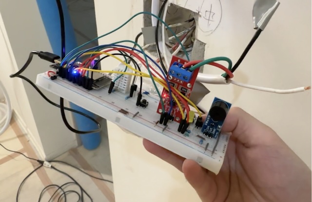
Home Automation
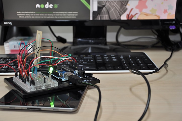
ESP / Electronics Prototyping